1. Overview
The MarifaLMS landing page is designed as a modern, conversion-focused interface for an online learning platform. It communicates value clearly, showcases available courses, builds trust through testimonials, and guides users toward enrollment.
The page follows a structured flow:1. Hero (value proposition)
2. Course highlights3. Platform credibility4. Testimonials5. Additional course discovery6. Call-to-action (CTA)7. Footer (navigation and support)
2. Header SectionPurpose
Provides global navigation and quick access to key areas of the platform.
Components
-
Logo: Positioned top-left for brand identity.
-
Navigation Menu:
-
Home
-
Courses
-
Quizes
-
Classes
- Blogs
- Instructor
- Others
3. Hero SectionPurpose
Immediately communicates the platform’s core value proposition.
Content
-
Headline: “Grow your learning skills with MarifaLMS”
-
Supporting Text: Brief explanation of platform benefits.
-
Primary CTA Button: Encourages users to get started.
-
Secondary CTA (optional): Learn more or browse courses.
-
Visual Element: A student holding books, reinforcing education theme.
-
Ratings/Badges: Social proof indicators.
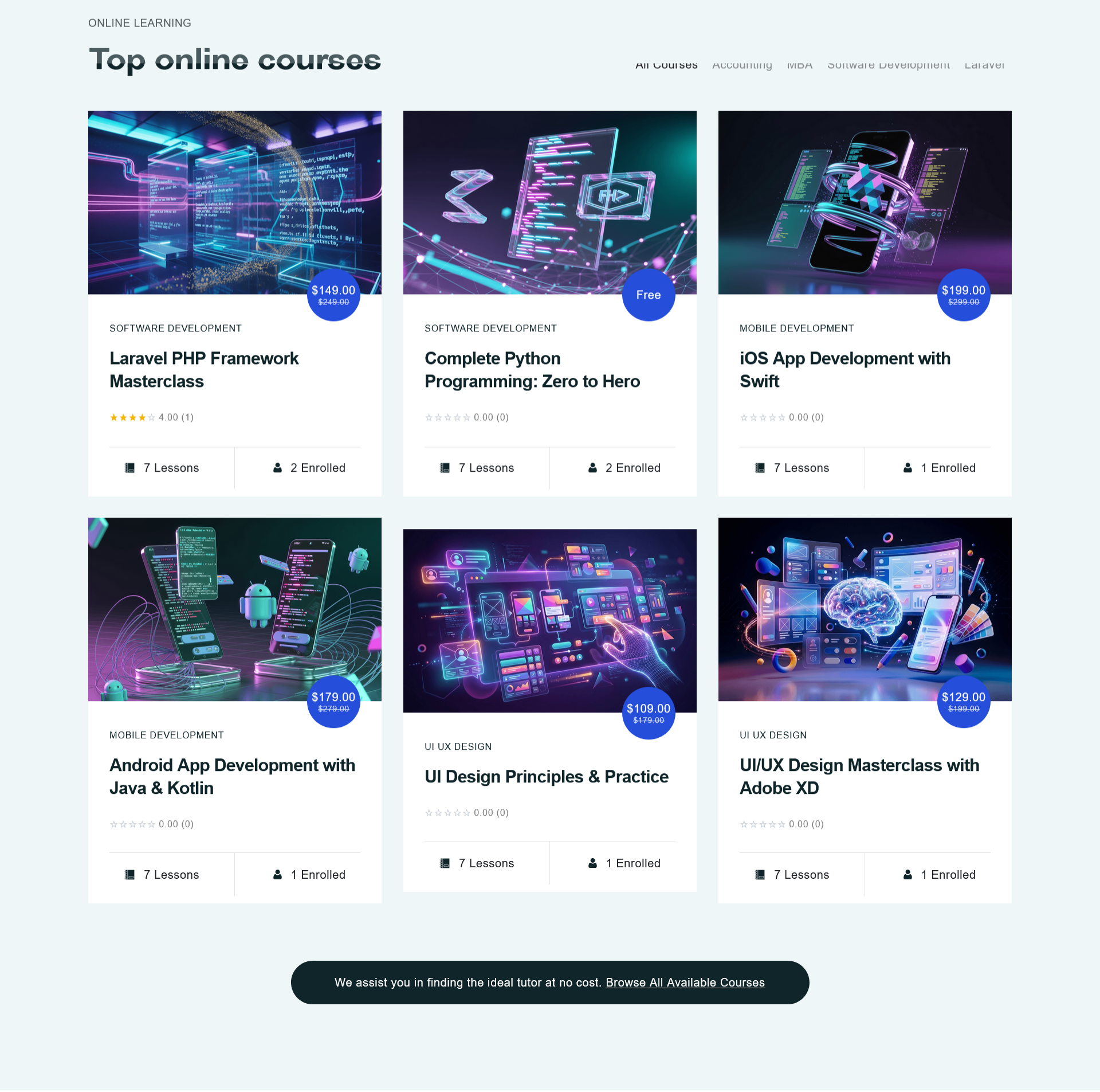
4. Top Online Courses SectionPurpose
Showcase featured courses to drive engagement and conversions.
Components
-
Section Title: “Top online courses”
-
Course Cards (grid layout):
-
Thumbnail image
-
Course title
-
Instructor (optional)
-
Rating
-
Price or enrollment status
-
Action button (e.g., “Enroll” or “View Details”)
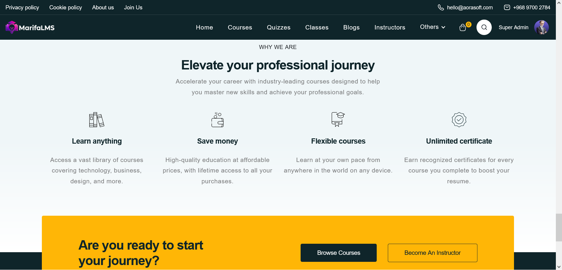
5. Experience / About SectionPurpose
Establish platform credibility and expertise.
Content
-
Headline: “Experience over 10 years with online education”
-
Description: Highlights platform strengths and teaching quality.
-
Bullet Points:
-
Expert instructors
-
Flexible learning
-
Certification support
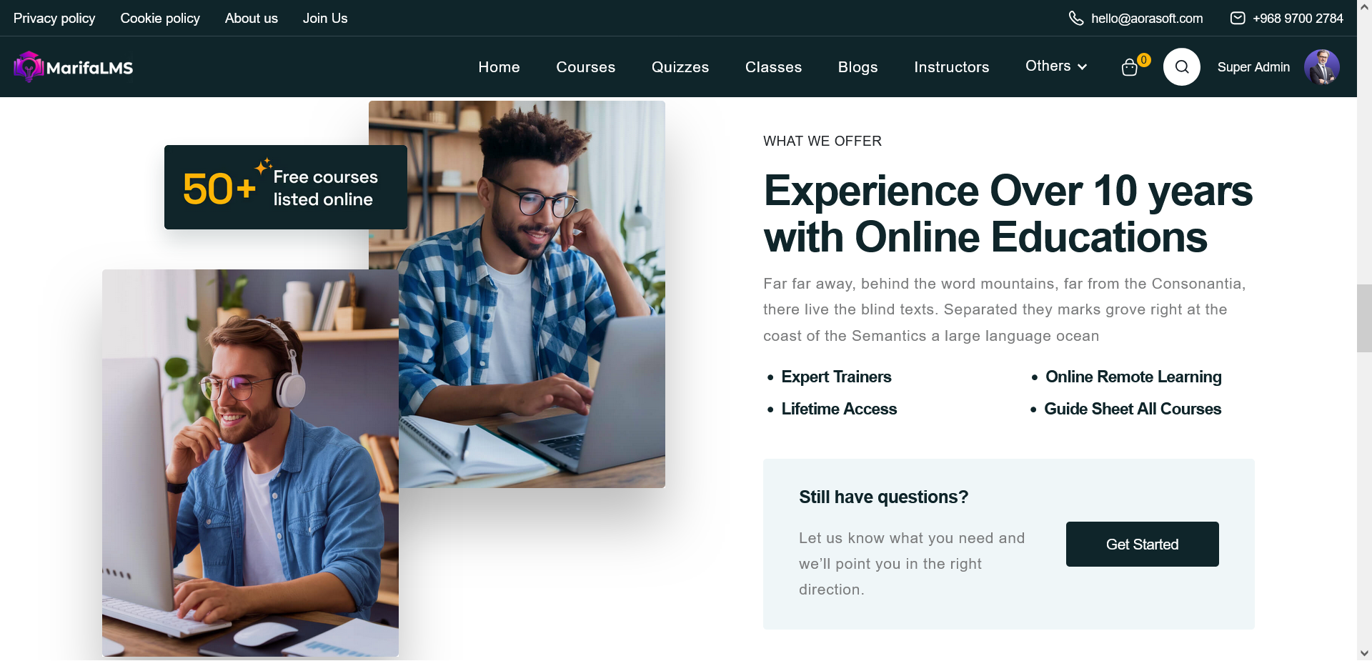
6. Testimonials SectionPurpose
Build trust through student feedback.
Components
-
Section Title: “Trusted by our successful students”
-
Testimonial Card:
-
Student image
-
Quote or review text
-
Name and role (optional)
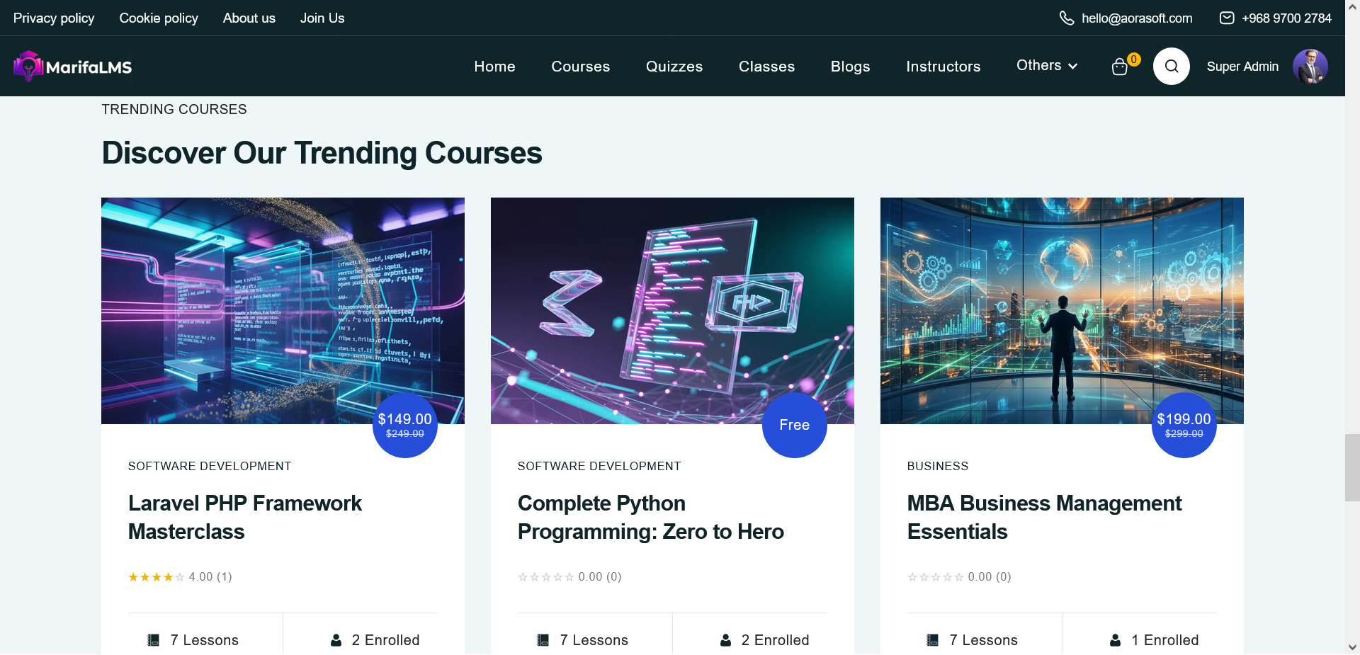
7. Trending Courses SectionPurpose
Encourage further exploration of course offerings.
Components
-
Similar to “Top Courses” but focused on trending or popular content.
-
Includes multiple course cards in a horizontal or grid layout.
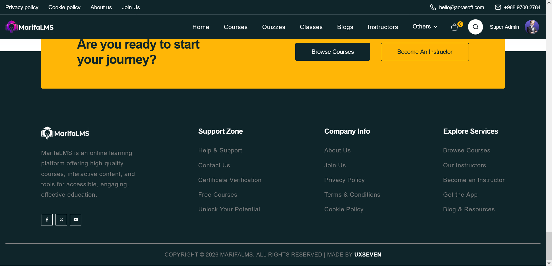
9. Call-to-Action (CTA) SectionPurpose
Drive conversions by prompting user action.
Content
-
Message: “Are you ready to start your journey?”
-
Primary Button: “Start Course”
-
Secondary Button: “Browse Courses”
10. Footer SectionPurpose
Provide additional navigation and support information.
Components
-
Logo and Description
-
Quick Links:
-
Support Links:
-
Contact Info
-
Social Media Icons
The MarifaLMS landing page is structured to guide users from awareness to action. It combines strong visual hierarchy, social proof, and clear CTAs to maximize engagement and conversions while maintaining a modern and professional design.