A color scheme is one of the first elements to communicate the message behind the design on both visual and psychological levels. The color scheme is one of the most important elements because, when used correctly, color can reflect the niche and even the overall business marketing strategy. Different colors can create a different mood for artwork. Mood means the feeling we get when we look at a work of art. We can create the mood by selecting warm or cool colors that remind us of the emotions we want in our artwork.
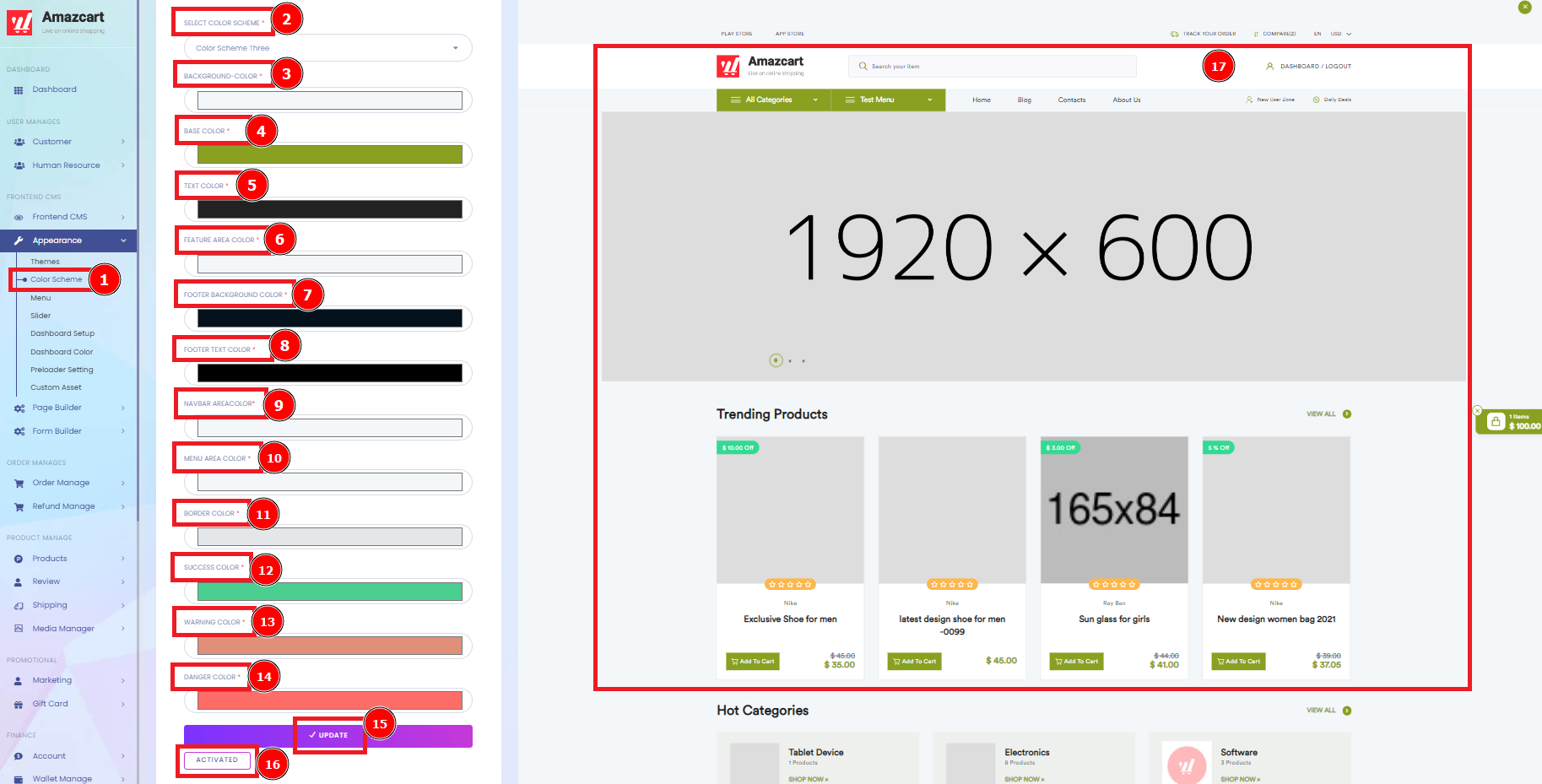
Short Direction:{AmazCart> Dashboard> Appearance> Color Scheme> Select Color Scheme> Background Color> Base Color> Text Color> Feature Area Color> Footer Background Color> Footer Text Color> Navbar Area Color> Menu Area Color> Border Color> Success Color> Warning Color> Danger Color> Update> Activated> AmazCart Home Page.}
If you want to set it individually on color then go to Appearance.
1- Color Scheme consists of a combination of colors used in a range of design disciplines, from fine art to interior design to graphic design. Each color scheme consists of one or more of the twelve colors present on the color wheel.
2- Select Color Scheme can save the part that you already made, this section is ready to use rapidly or to follow the order like Color Scheme One, Two or Three.
3- The background color is, in most cases, displayed in the form of an RGB triplet or a hexadecimal code. The three separate pairs of numbers you are given represent the different color values of the RGB spectrum. The first value stands for the red color, the second for the green color and the last for the blue color.
4- Base Color applied at the root area or all over before a dimensional/creative color technique is done.
5- Text Color According to various studies, dark text on light backgrounds tends to be most readable. Go for this approach if you're looking for a clear and crisp presentation, particularly for web design. White backgrounds: Simple and classic, black text on a white background provides the highest readability ratio.
6- Feature Area Color influence how we interpret what we purchase. If you're looking to attract impulse buyers, look to red, orange, black, and royal blue. Shoppers on a budget, however, will find navy blue and teal hues appealing.
7- Footer Background Color with high contrast, such as a light background with black text or dark background with white text. Avoid using varying colors or ornate typefaces. The classic (and most readable) text and background combinations around for footer information – white on black.
8- Footer Text Color typically contains a copyright notice, link to a privacy policy, sitemap, logo, contact information, social media icons, and an email sign-up form. In short, a footer contains information that improves a website's overall usability.
9- Navbar Area Color By default, your top navigation bar's background color will be white. For a more dynamic and strong site, use the opposite color of your website background for your navbar background.
10- Menu Area Color can be Yellow, green, cyan and magenta are good colours to choose if you want to make text stand out, such as headings or important links on a webpage.
11- The border-colour property sets the color of an element's four borders. This property can have from one to four values. If the border-color property has four values: border-color: red green blue pink; the top border is red.
12- Success Color stand by Green is a universally calming color. You'll find more variants of green in nature than any other color. It's also commonly associated with good luck, abundance, money, and growth – and is a great color for success.
13- Warning! Yellow often indicates a warning that might need attention.
14- Danger Color is Red – which indicates, danger, stops or the presence of fire protection equipment.
15- All the color section is done then click on the Update button.
16- Activated if you want or you would like to save it.
17- AmazCart Home Page is showing you the changing color structure on based what exactly the looking like this.